[ Clinical ] help choosing the UI for Drug compendium mobile app

Hi, I have a drug compendium app on google play. It lists all the drug that is available to a certain country. I want to port the app to meteor. Since I am porting, this is the right time for changing the UI. Currently the UI looks like this:

Lets say you clicked on the first item, it opens this page,

then click on the first item again,

then you see this page which lists all the data for the drug.

and finally there is the search page

But there is another popular app on the market which looks like this :

Both have lists just a bit different search criteria and a different homepage. I am going to go using the later UI. But if you want to integrate this with anything else like an hospital management system? Should the UI change?

1 Like

Hi @kaiyes,
Looks like a great project you’ve got here! Would love to see this join the Meteor ecosystem! :smile:

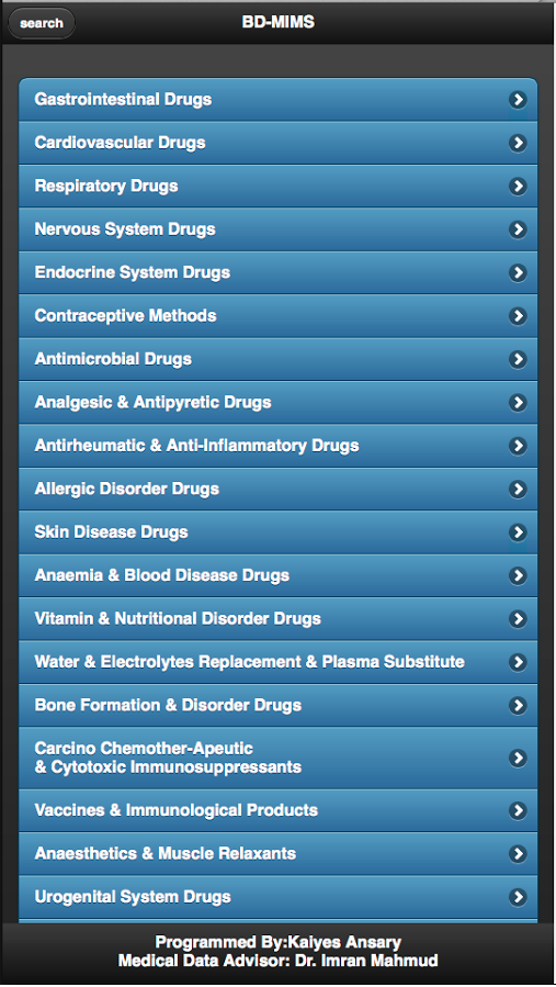
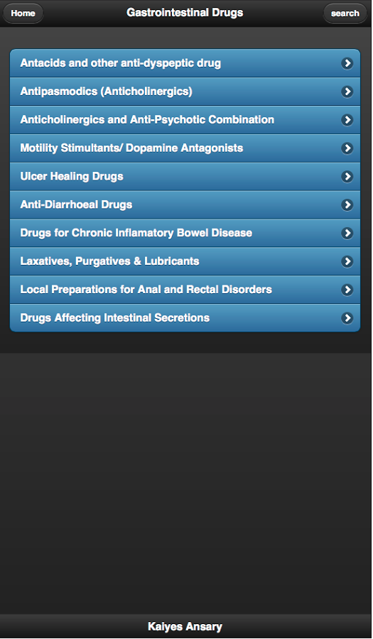
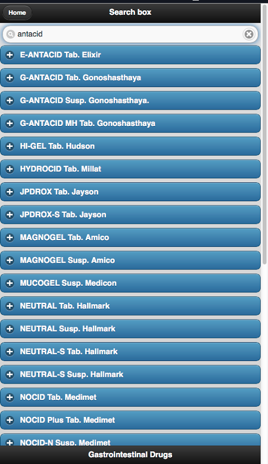
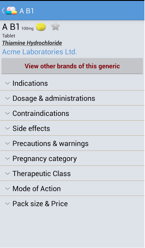
So, yeah, looks like you have a pretty standard jQuery UI app, from just before when Metro was released. The two usability items that are immediately noticeable, are the padding around your main list; and the list rows are somewhat thin. Apple usability guidelines recommend that the average surface area of a human finger is around 40px, so most of the lists in the Clinical track are going to be set at 50px by default.

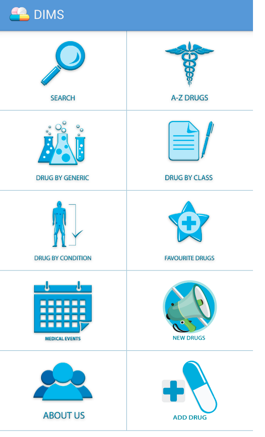
As for the popular app you’re comparing to; I’ll mention a few things… it’s got the tiles which is more of a Metro design; but the whoever selected the icons was working with a limited icon set. It’s questionable how much they actually communicate what each button does. Check out the Noun Project for a much wider selection of icons. Also, the search bar and tiles are definitely the way to go. Maybe right justify the pill icons, and the rounded corners and padding can probably go. But as far as usability goes, everything else is pretty close to best practice.

I think you’ve got a good game plan already for the next iteration.

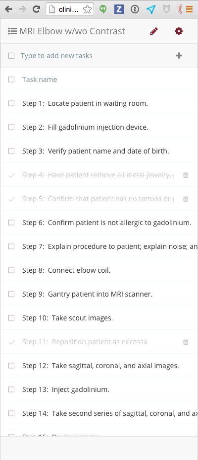
So, as far as Meteor examples to work with, take a look at the Clinical Checklists demo app. It’s a multi-user version of the Todos app, and is still a bit rough around the edges. But it’s reasonably current, and should provide plenty to work with until we publish the first release candidate in a few weeks.

http://clinical-checklists.meteor.com/lists/aDrwtGKxbG45zkbBD

Keep in mind that when you resize the app, it will condense to the following UI for mobile devices. So if you can use the Clinical Checklist demo to get your Drug compendium roughly looking like this…

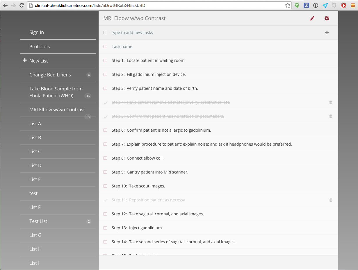
Then it should also be able to display on a tablet or desktop like this:

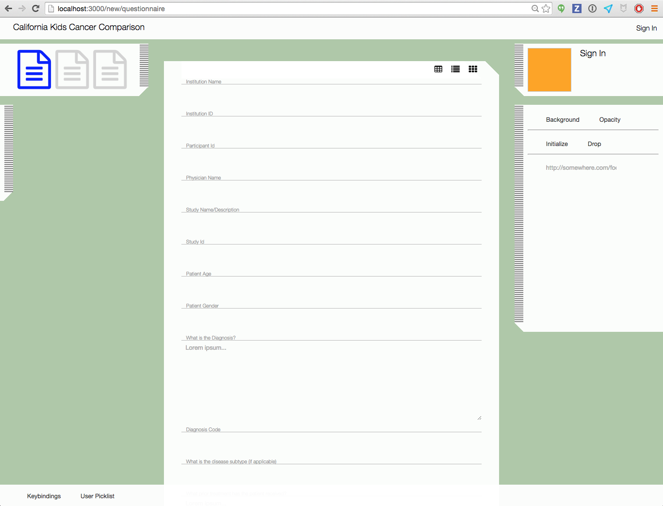
And we’ll be ready to move it over to the EMR framework when the time comes (which will look something like this, btw… sneak peek; yeah, it’s bordering on being an operating system. Shhh. Don’t tell anyone. :wink: )

Also, the Clinical track is getting the theming components from the Groupthink app (and probably the bulletin board system, too, at some point). So don’t stress too much about the color schemes. We’re releasing with enough basic theming to approximate the current dark/blue layout. Work on importing data into Meteor, displaying the compendium in lists, getting search working, etc.

Oh, and use the nemo64:bootstrap package if you need a basic UI framework. It gets people started with Bootstrap, but lets us use only the parts we need; meaning we can keep Bootstrap as lean as possible. Clinical Meteor is going to be filled with advanced animations, which requires us to not use CSS frameworks like Zurb or Bootstrap. So we want to minimize our use of jQuery UI and Bootstrap.

1 Like

That part is easy. Its just if I want offline capabilities then I will have to use Ground db or some other solutions, since it was/is targeted towards mobile users.

mobiles apps have hard time keeping up with these frameworks. And I wanted to use vanilla css/less for all my apps, web and mobile alike. Its the responsive stuff that compels me to use a framework. But for Clinical is going to be one of a kind, so making things from scratch makes sense.

I was gonna use Materialize for this. But I might just use the demo and see how it goes. It will be extra work to change the UI to clinical again. Besides the sidebar in the todo demo is reminiscent of basic tablet-phone layout used in android.

On a separate note, if a release is due in just few weeks, I might just use that mileStone release then and not use the demo now as I have another e-commerce project that needs time.

Cheers.

hmmm, I was thinking about it just yesterday that can we use Ubuntu med or any other linux distro work for us? Then we can just use applets inside it. So the EMR framework will be a heavily customised linux distro and the applets will be separate meteor apps but working together. Since canonical is taking ubuntu to be an all around OS that works in phones, tablets, desktop, tv etc etc. They had another interesting proposition here,

http://www.ubuntu.com/phone

So when you put the phone on a dock, the dock has MHL port that can connect to a display, say a TV and can become a full fledged OS. So there is two modes, phone and desktop. Phone runs on top of the desktop. And when docked, it runs the desktop. If you connect a keyboard and mouse you have a working desktop really.

Also they have the core for internet of things so that could have been used later as well. that is the way a local company is using their product. ERP with IOT. I guess we could easily merge that IOT and capture/create a new market. The glass UI combined with that linux power could become something else entirely.

I think the OS is the right step. Curious to know what it is? Meteor ?? !! ??