Really like the idea and feeling of the app @squallstar! Great job, might use it as I’m quite messy with my browser bookmarks 
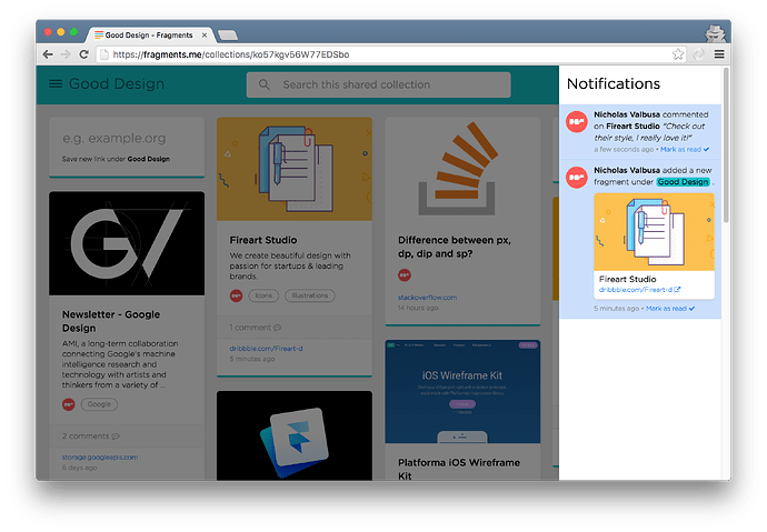
Just wanted to give you guys a quick update, I just implemented notifications for collaborative collections, so you can quickly see what’s going on.
You can invite other people to your collections by copying the collaboration link you’ll find in the collection settings page (which is accessed via the gear/cog icon in the sidebar).
Vert nice and clean UX. I’ll keep an eye on it !
Nice work! Thanks for sharing. I really like the clean layout and animations.
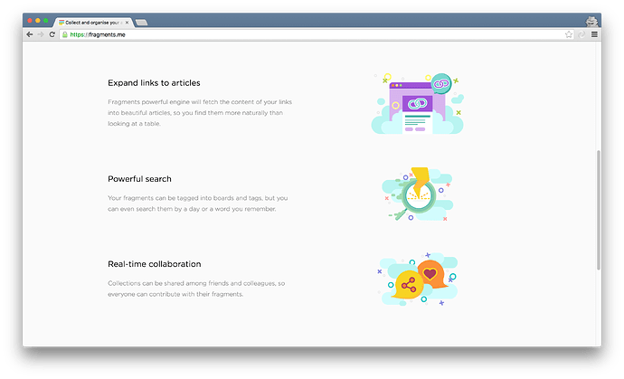
I like the icons and cartoon pic/style on your site. I have see this design style all over the modern web. Did you design those yourself, or is there some awesome repository online that contains a bunch of those cartoon templates?
Some of the illustrations (like the foxes) have been designed by my wife a couple of years ago. She actually sold the whole set of 60 something emotes on Creativemarket I think.
About the icons on the marketing website, they’re from the Flat Pro set I believe, which I bought two years ago.
Regarding the rest of the design, it’s all handmade components I made. I’m not a designer, but I like good design so I like to keep myself up to date 
Wooww! Congratulations!
Super well done app.
I loved it.
It’s odd that I can’t highlight words on the home page. I was trying to copy the text to Tweet it, but alas, I guess I’ll have to write it by hand.
Quick update: over the past week I’ve released tons of improvements to real-time collaboration and commenting, and many other new exciting things will be released in the upcoming weeks.
My wife has also just started to help me with some re-design overhaul, starting from the artworks found across the website and webapp. Here you can see a preview of the style we’re going to use!

