Hello,
I am trying to have 6 images per row but its not working. It happened to me earlier using Materialize so I switched to Bootstrap hoping that would help. Maybe someone can see what is going here.
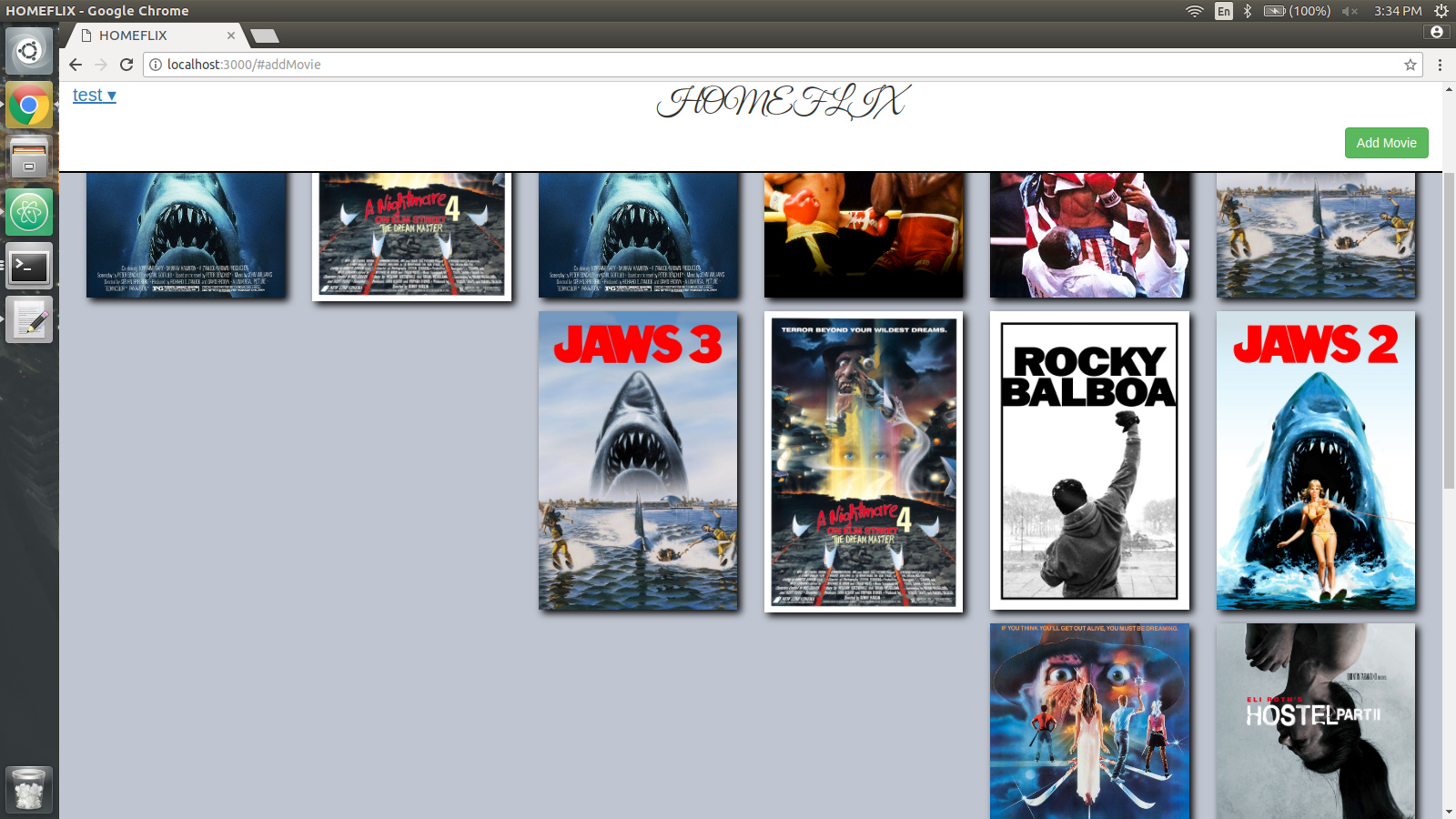
I will post an image of what it looks like and some code.
<head>
  <title>HOMEFLIX</title>
  <meta name="viewport" content="width=device-width, initial-scale=1, maximum-scale=1">
  <link href="https://fonts.googleapis.com/css?family=Great+Vibes" rel="stylesheet">
</head>

<body>
  {{> Nav}}
  <main>
    {{> AddMovie}}
    {{#if currentUser}}
    <div class="row movie-div">
      {{# each movies}}
        {{> MoviesList}}
      {{/ each}}
    </div>
    {{else}}
    <h1 class="please-login center-align">Please Log In</h1>
    {{/if}}
  </main>
</body>
<template name="MoviesList">
  <div class="col-lg-2 col-md-2 col-sm-6 col-xs-12">
    <a href="#{{divId}}"><img class="{{genre}} shadow img-responsive" src="http://127.0.0.1:8000/images/{{img}}"></a>
  </div>

  <!--  <div id="{{divId}}" class="well hide">
      <div class="">
        <h1>{{name}} ({{release}})</h1>
        <a class="delete-movie"></a>
        <p>{{plot}}</p>
      </div>
    </div> -->
</template>