For a BI Dashboard, I am currently looking into making time-series graphs more accessible. A good way is to use context information and I am indecisive between React vs. Blaze.
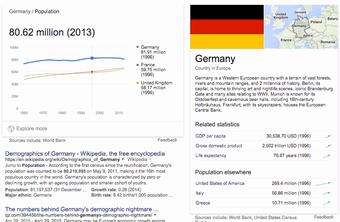
Example: Search for “population Germany” on Google, you’ll get an interactive time series graph related to other countries and statistics. Inside the right panel data is changing in real-time depending on the hovered/selected segment of the primary graph. Which gives a pretty good sense of relation.
GIF: https://drive.google.com/file/d/0B4SUqHeXaKd2Ty1tLTV5RkhjZzQ/view?usp=sharing
What would be a meteor (mobile performant) implementation of this “lose component coupling” here? Do you have any ideas how to do it with React or Blaze?
Screen Ref: