Hi.
I’m developing with Meteor - Angular2 Using Angular 2’s Flex Layout (GitHub - angular/flex-layout: Provides HTML UI layout for Angular applications; using Flexbox and a Responsive API)
I want a responsive result when screen size goes to smaller than 500px.
It works well just resize my screen, but using real device or chrome’s device toolbar It goes to suck…
Here is my screen shot of result, and codes
import { Component } from '@angular/core';

@Component({
  selector: 'demo-responsive-layout-direction',
  template: `
        <div class="containerX">
          <div fxLayout="row" fxLayout.xs="column" fxLayout.sm="column" fxFlex class="coloredContainerX box" >
            <div fxFlex> I'm above on mobile, and to the left on larger devices.   </div>
            <div fxFlex> I'm below on mobile, and to the right on larger devices.  </div>
          </div>
        </div>
  `
})
export class DemoResponsiveLayoutDirection {  }
Working with Screen Resizing
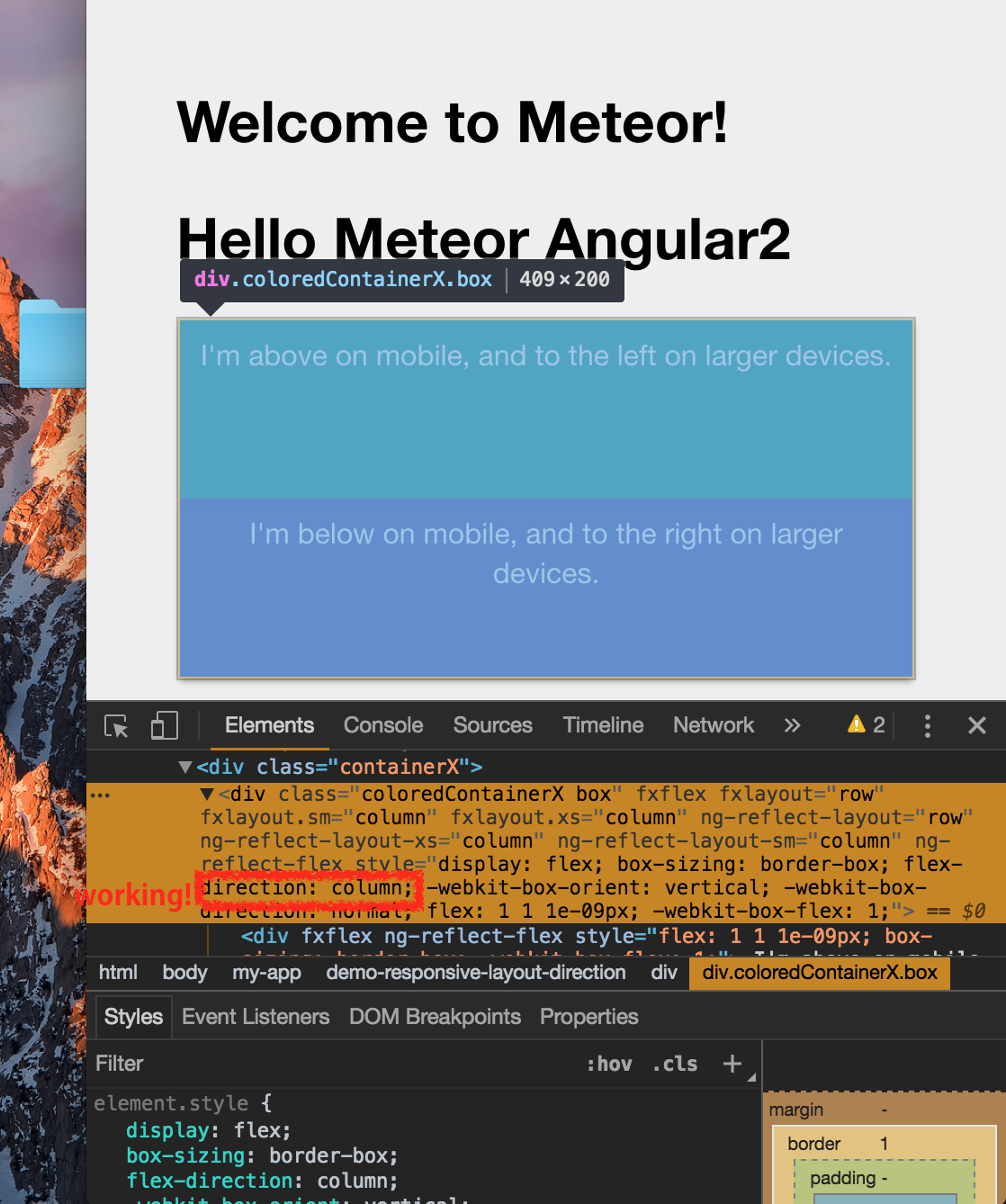
Not Working with Mobile mode
