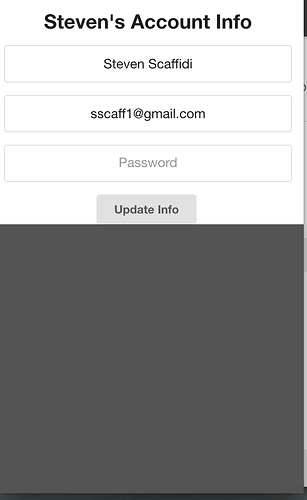
I’m building a mobile app with Meteor and Semantic UI. Every time I open the sidebar though my screen gets cut so that just the part of of the body with something on it shows and then the part without anything in the body shows grey. It re-renders based on the size of the body. Semantic says to do this:
iOS Sidebars
Sidebars use a special fix for iOS that are added using userAgent detection.
This should have no meaningful affect on your code, but will prevent the canvas from incorrectly autoresizing when a sidebar opens.
html.ios {
  overflow-x: hidden;
  -webkit-overflow-scrolling: touch;
}
html.ios,
html.ios body {
  height: initial !important;
}
However, that doesn’t seem to fix the problem. Anyone with any experience with this?
