We working on https://listen.meteorapp.com, You can check it out .https://nb-accounts.meteroapp.com
gives a DNS probe error
It’s kind of a disorienting experience to open one meteor app and then be redirected to another to log in.
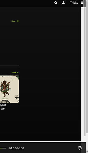
A couple bits of feedback… There 3 scroll bars layered on the right edge of the screen, 2 of which are basically decorations. Also if you play a song by clicking on it on the what’s new tab, it continues to play if you navigate away to another part of the screen, but then there isn’t a way to stop it. Other than that it’s good.
It’s the brand system . Other services will be provided that require a single account . That’s why there is SSO .
The scrollbar. It seems you use a browser not chrome. It’s meant for you to scroll horizontally when there are items in those sections
I understand, there just isn’t anything that indicates that it’s part of a larger product and therefore not a cohesive experience at the moment.
Actually the I use chrome, but the scrollbars I’m referring to are all vertical.
Scroll bars should appear on their own when elements overflow their container. As far as I can tell this shouldn’t be necessary and with a bit of CSS tweaking in the inspector, I was able to make all the elements flow naturally and none of the scrollbars besides the one on the window appear.
Finally, the previous comment that there wasn’t a way to stop the audio was incorrect. It was there, but was hidden by the cookie popup ![]()
Not trying to nitpick, just a bit of feedback to polish things up a bit.
Sure . I appreciate. Will look into those.
Hey @engrpeters,
I’m building something similar, well im having something built that’s similar - i’d be interested to see exactly what you made, as the links dont work?
it’s now archive , is your project live ?
