New app launch: Virtual In/Out Board

Hi everyone,

I’m proud to announce the launch of my first Meteor app, Virtual In/Out Board: https://www.virtualinout.com
This is an on-line in/out board to replace the magnetic boards or whiteboards many offices use to keep track of where employees are.

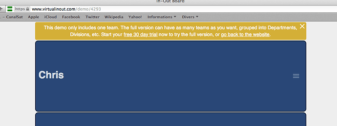
There is a live demo embedded into the landing page which can also be opened in a separate page. To experience the full admin interface and multiple teams it’s necessary to sign up for a 30 day free trial.

This is a perfect use case for meteor - several users subscribed to the same set of data and expecting instant updates across devices.

We were looking for an app like this for our company nearly two years ago. There are many competitors out there, but I didn’t like they way they looked or their pricing structure. This was about the time I first heard about Meteor so I thought writing my own would be a great way to try out this new, exciting framework.

I’m aware that the landing page is not light weight - I will try to fix this by making the sales site a separate, static site with the live demo embedded in iframes.

Many thanks to the developers behind Meteor, plus the packages I use, particularly zodiase:mdl (@zodiase), mizzao:partitioner (@mizzao) and the various MUP(x) forks, most recently mupx-letsencrypt@meteor14 (@tsepelev).

I’d welcome any comments or constructive criticism anyone has on the app or site design.

4 Likes

congratz on your new app

Hi Chris @wildhart,

I don’t know if I’ll be able to provide a constructive feedback, but let’s go.

I’ve tryed the demo in FF and Safari/iPhone : imho it’s unusable, such a simple app should be intuitive (no need for documentation to use it), unable to understand the purpose of “in” (why do I have to set a time/date and location when i’m back ?). It seems that you designed the app specifically to your needs/organization. Did you asked other companies that uses In/out Board ?

I don’t know if the theme is customizable in paid version but your unique blue color is sad (looks like an app for accountant or from SAP ? same for the web landing page) -> put colors, animations from MD, use rather cards than list !

Who will pay for this ? I think the value you bring is not worth the money, here is what could be done with Trello in 5 minutes : in-out-board-mvp is also multidevices, realtime update, no cost :wink:

Nice feedback on mentionned packages, especially partitioner I was not aware of thank you for that.

Hi @lc3t35,

Thank you very much for taking the time to have a good play with my app and giving a detailed response.

You’re right, I did design the app specifically for our own needs (but mostly as an excuse to try Meteor!), but only because nothing on the market was meeting our specific needs (see below). I don’t think our requirements are unique so hopefully other businesses share our requirements. I already have a few companies signed up for a free trial and using it every day across multiple teams/offices in the same way that we do, hopefully they will convert into paying customers which should easily cover running costs.

Hopefully it is intuitive: a simple click/touch on your name and you’re “out”, another click and you’re “in”. I’d be genuinely interested to know what distracted you from that simplicity so that I can work on that? Do you think that the mere existence of the FAQ makes it look complicated? What documentation there is (including the mikkelking:meteor-hopscotch tour, thanks @mikkelking) hopefully only serves to reveal the more advanced features which are under the surface.

There is no need to set a status or time when you’re “in” (or when you’re “out”). However, people in my organization (and also in my free trial users so far) see a value in saying “at my desk” or which office they’re working in, or that they’ll only be in until noon. Particularly in a large building or multi-site organisation there are different types of “in”.

The other specific requirements our organization had were:

  • Large easy to read (from a distance) display so that we can mount it on a tablet on the wall, but still works well on desktops/tablets/phones.
  • Flexible permissions - some teams are happy to let anyone change each other’s status, other teams want that locked down so only you (or your boss or receptionist, etc) can change your status.

The colors can be changed in the admin interface, either for the company as a whole or for individual teams - I’ll have a play with different defaults, thanks for your feedback on that. The admin interface makes extensive use of Material Design (there’s a few screenshots here), but (for our purposes) the main display needed to be a bit more bold and ‘in your face’.

Who will pay for it? We’ll see, but so far it’s looking promising. We are cheaper than all of the other quality competition, but we also don’t offer some of their features (timesheet logging, geofences, wifi beacons, etc). Such a ‘simple’ app is not mission critical so shouldn’t be expensive, but the free ones don’t cut it aesthetically or flexibility wise, so we are hopefully filling a gap in the market in between the two.

Thanks again for your feedback, you’ve given me some things to think about.

Chris.

1 Like

@wildhart
answering your question about intuitiveness : the only thing looking clickable for me on the list is the menu button on the right side, I had no indication that the list was clickable, so I never click on it (until I read the FAQ) to out/in.
You can simply add this text “click here to out” / “click here when you’re back” or “I’m back” (terminator style :wink: ) (when status is out) between name and menu, then the UI will be obvious.
Or provide also a tour the first time it’s launched even for these “obvious” simple features :wink:

@lc3t35, thanks for getting back to me again.

There should be a hopscotch tour when you open the demo, see this screenshot I just took. It should pop up after 2-3 seconds of opening the demo. Did it appear for you? If not, which browser/OS?

I’ll think of ways to make it more obvious, thanks for your suggestions.

no hopscotch in FF 48.0.2, Chrome 49.0.2623.112, Safari 6.2.8 / OSX 10.8.5 :frowning:

I always have a demo popup at top.
No error message in console.