Hi! I’m using the simple yet excellent babrahams:editable-text-wysiwyg-bootstrap-3 package to edit and store my blog posts. I’m saving the following fields in the collection: _id, title, content, image, date and author.
I’m the only user who will have editing priviledges.
I have a list of posts route (loaded with an infinite scroll) that has the following template:
<template name="posts">
	<div class="page-header">
	  <h1>Blog</h1>
	</div>
	<div class="container">
	  {{#if Template.subscriptionsReady}}
             <div id="posts" class="row list-group">
	        {{#each posts}}
		<div class="item  col-xs-4 col-lg-4 list-group-item">
                  <div class="thumbnail">
                    <div class="group list-group-image">
		       <div class="imageThumbnail" alt="{{title}}">{{{image}}}</div>
		    </div>
                  </div>

      <div class="caption">
        <div class="row">
          <div class="col-xs-12 col-md-6">
		<h3 class="group inner list-group-item-heading">{{title}}</h3>
		<p class="group inner list-group-item-text">{{author}}</p>
                <p class="lead">{{formatDate date}}</p>
          </div>
          <div class="col-xs-12 col-md-6">
	      <button class="btn btn-success postsButtons">View details</button>
          </div>
        </div>
      </div>
    </div>
{{/each}}
</div>
{{else}}
	{{> spinner}}
{{/if}}
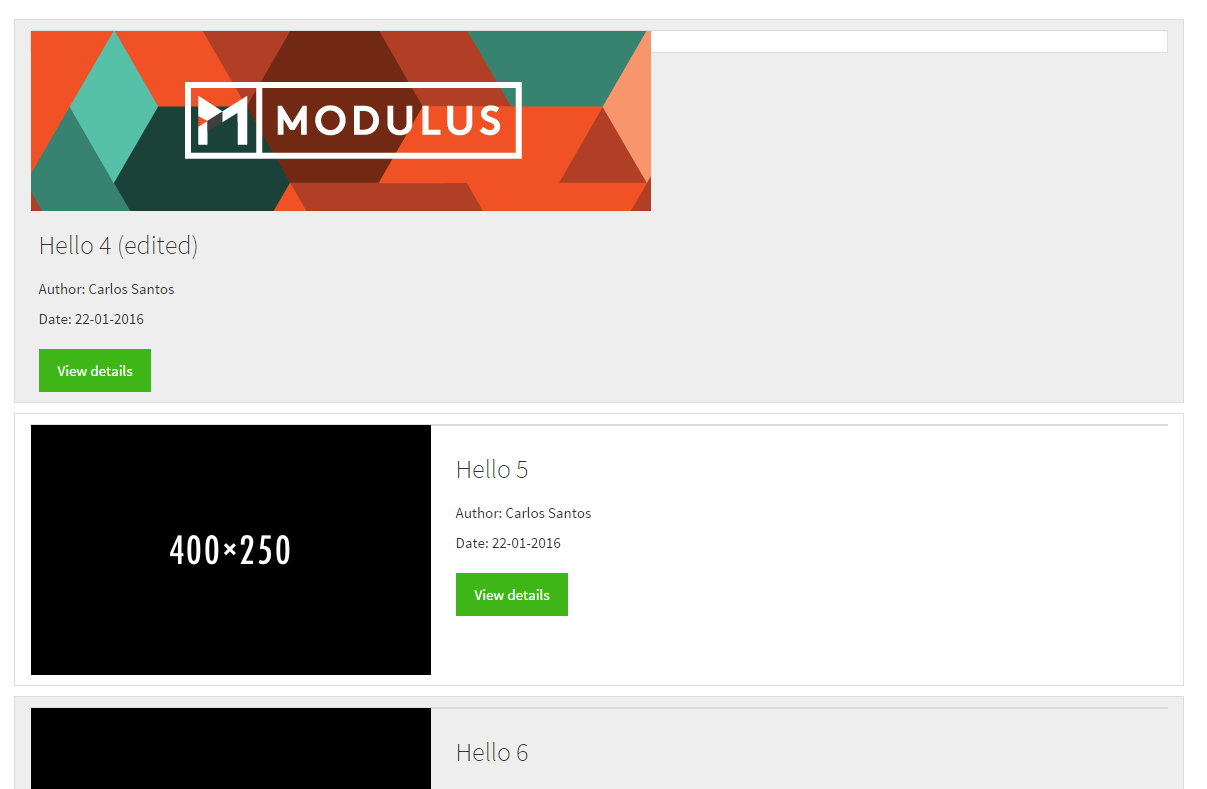
The {{{image}}} loads correctly however I can’t seem to set it to fit the containing div which should be 400px by 250px (it’s a thumbnail). In the other route, the postDetails one, pertaining to a single selected post, the image can have its original size.
I have tried the following CSS to no avail:
.group .list-group-image{
  width: 400px;
  height: 250px;
}
.imageThumbnail{
  width:auto;
  height:auto;
  max-width:400px;
  max-height:200px;
}
Any clues on how to nail this issue down? I’d appreciate any answers to maintain the image as a responsive element as well.
Instead of
.group .list-group-image
it must read
.group.list-group-image
Don’t know if this actually will do the trick, but this selector is definitely wrong.
1 Like
That definetely helped a bit but the problem remains:
I changed that CSS code to be like:
.thumbnail.group.list-group-image{
  width: 400px;
  height: 250px;
}
The issue also stems from the fact that {{{image}}} is a full fledged ![]() tag… but I can’t edit that tag itself:
tag… but I can’t edit that tag itself:
<img src="http://blog.modulus.io/img/default-header.png">
What exactly are you trying to achieve? To make this modulus image fit the whole gray area?
PS: It does not matter where the tag actually comes from. The CSS should work despite of its origin. I assume your CSS ist just wrong.
No. Rather the small white area you see coming out of it. The images below were added manually in the initial data dump, and i’d like any images I insert in the Wysiwyg (like the Modulus one) to come out like those 400x250 images in the posts listing while keeping their original size when I go to the details. Thus I only want to resize them here.
Try this:
    <div class="container">
      <div id="posts" class="row list-group">
        <div class="col-xs-12 item list-group-item">
          <div class="thumb" alt="{{title}}">
            {{{image}}}
          </div>
          <div class="caption">
            <div class="row">
              <div class="col-xs-12 col-md-6">
                <h3 class="group inner list-group-item-heading">{{title}}</h3>
                <p class="group inner list-group-item-text">{{author}}</p>
                <p class="lead">{{formatDate date}}</p>
              </div>
              <div class="col-xs-12 col-md-6">
                <button class="btn btn-success postsButtons">View details</button>
              </div>
            </div>
          </div>
        </div>
      </div>
    </div>
together with
      .thumb {
        float: left;
        overflow: hidden;
        position: relative;
        height: 250px;
      }
      .thumb img {
        width: 450px;
        max-width: 100%;
        position: relative;
        top: 50%;
        left: 50%;
        -webkit-transform: translateY(-50%) translateX(-50%);
        -ms-transform: translateY(-50%) translateX(-50%);
        transform: translateY(-50%) translateX(-50%);
        padding-right: 5px;
      }
      .caption {
        padding-top: 10px;
      }
Note: The class “thumbnail” is already defined by Bootstrap and adds a white border to an image, so I renamed your class.
1 Like
Scratch my previous answer. I’m very tired and did something dumb (pasted the code in the postDetails instead of just post).
Your solution works partially, as it’s now showing the correct width, just not the height.
Hm. Seems as if the top:50% is not doing what it should. Do you have a git repo to look at? It’s not easy to judge if you don’t have the full context.
I just created one and I had commits. I already changed it a bit and got it a bit closer to what it should be but nevertheless it does not seem optimal. Here is the GitHub link. https://github.com/mesosteros/carlosesantosSite
You forgot to include the .meteor folder. The app is crashing because packages are missing. Only the top level of the .meteor folder has to be included (not the large sub-folders).
Done. My .meteor was in my gitignore file. 
OK, it’s working now. But how can I add a new image? The existing placeholders are looking good.
You need to create an account, and then enter a post. Then select the placeholder and paste an image (with this WYSIWYG you can only put images by copy+pasting). Afterwards its just a matter of pressing the WYSIWYG’s floppy button.
I still haven’t implemented post insertion by the user or roles, I only have the update method from the WYSIWYG and my own delete button so far, so that is the only way to add an image for now.
Did not really get how to do it, so I patched the DB.
Here’s the CSS that should be working:
.thumb {
 float: left;
 overflow: hidden;
 position: relative;
 height: 250px;
 width:400px;
}
.thumb img {
 height: 250px;
 //width:400px;
 position: relative;
 top:50%;
 left: 50%;
 -webkit-transform: translateY(-50%) translateX(-50%);
 -ms-transform: translateY(-50%) translateX(-50%);
 transform: translateY(-50%) translateX(-50%);
}
There were some strange additions in your CSS files…