Root Cause Analysis
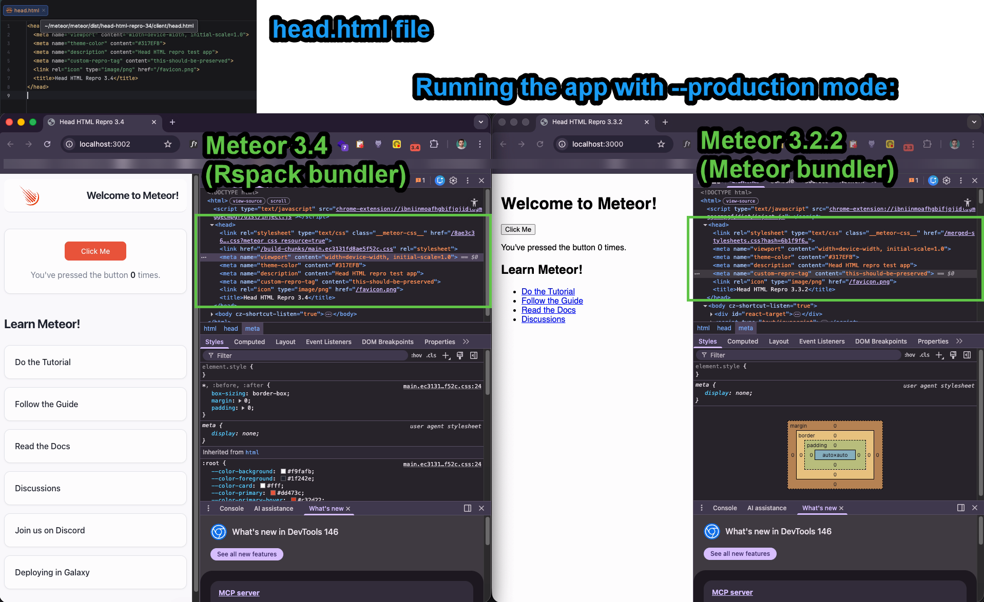
Missing Viewport Meta Tag in Production: Based on the screenshots, the browser is rendering at a default desktop width (~980px) and scaling down. This only happens when the <meta name="viewport"> tag is missing or ignored. While client/head.html contains the tag, the Rspack Production Build may be bypassing standard Meteor head.html bundling, or the production URL is utilizing a different HTML template that lacks this critical tag.
URL of the Production website can be provided via PM if Meteor team wants to quickly test it.
@nachocodoner - this is another problem for your ever growing list 
UPDATE:
 The Solution
I have moved the viewport definition directly into the Svelte root layout (App.svelte).
- Guaranteed Injection: By using
<svelte:head>, we force the browser to recognize the correct device width as soon as the JS app loads.
2 Likes
Thank you.
I’ll try to reproduce in a small example, hopefully it is enough for it. Otherwise I will ping you via PM for more details.
No luck on reproducing it yet at least on development mode with --production simulation, in a minimal repository using the skeletons.
I’m going to try next to generate the Meteor native apps for production. Also, to deploy web app to production and see if something gets different.
Do you have the means to reproduce it? It may be something specific behind your setup. Anyway, I will text next other edge cases on skeletons like with native specifically.
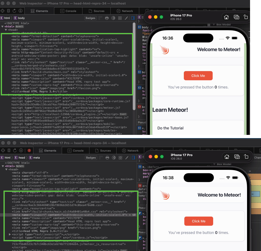
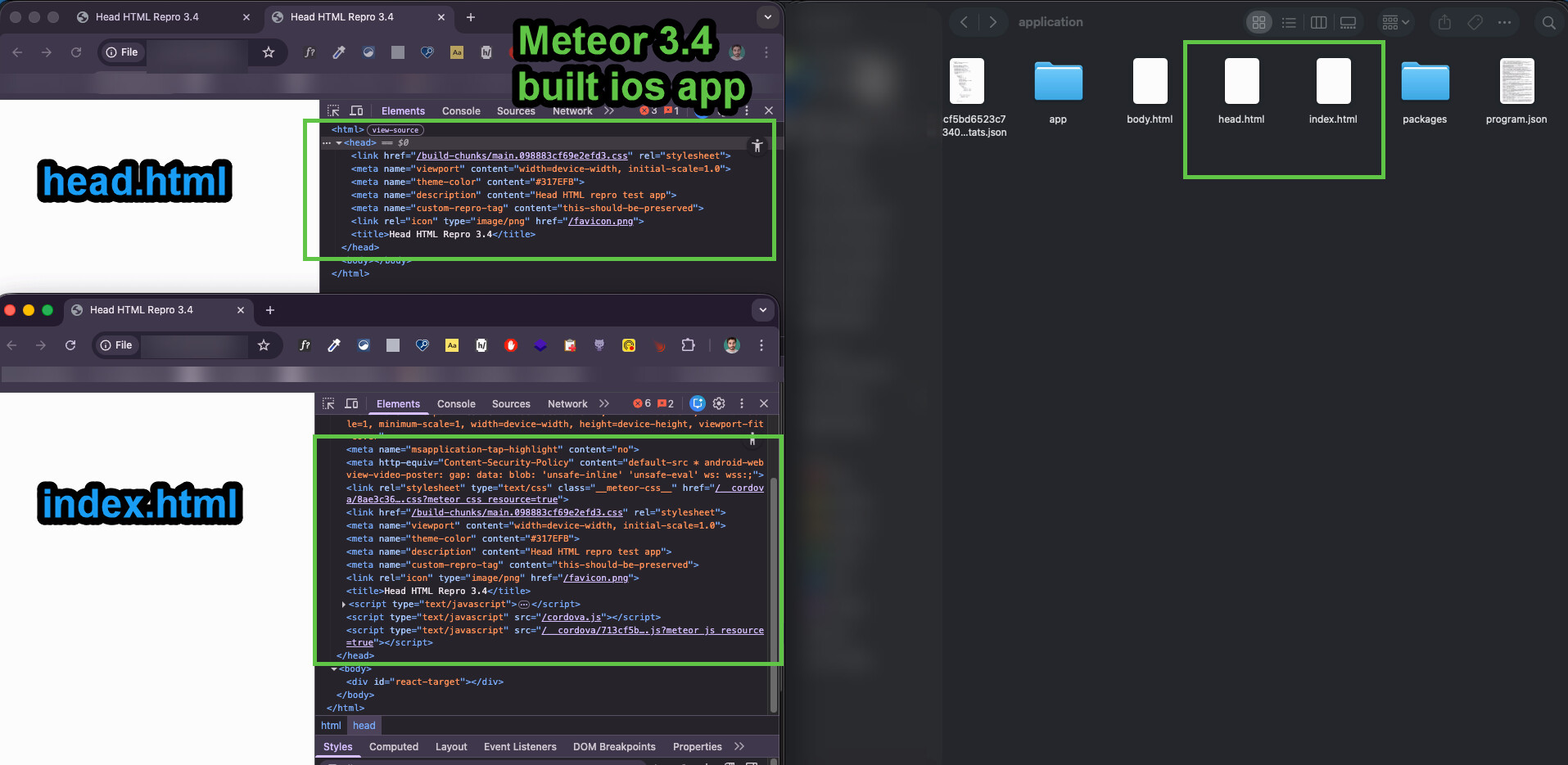
Not reproduced either in mobile app development or when building the mobile app and checking its contents.
head.html
<head>
  <meta name="viewport" content="width=device-width, initial-scale=1.0">
  <meta name="theme-color" content="#317EFB">
  <meta name="description" content="Head HTML repro test app">
  <meta name="custom-repro-tag" content="this-should-be-preserved">
  <link rel="icon" type="image/png" href="/favicon.png">
  <title>Head HTML Repro 3.4</title>
</head>
I consistently get the client/head.html contents. This issue may be related to a specific edge case in your app setup. I’d love to help, but I need a minimal reproduction repository for the issues you report, just like with others I was able to confirm and fix quickly all them for next Meteor 3.4.1 within modern-build-stack label. Ideally, we could track them within the repository issue section with proper reproduction steps.
Thank you