This is something I constantly go around in circles with:
Scenario: A clinician comes up with an awesome app idea, and tries their hand at some design work. They create some wireframes and maybe some photoshopped layouts using their component library of choice (Bootstrap/Polymer/Material/etc). They then hand off the wireframes to a staff member who is new to Meteor but enthusiastic about the problem domain. The clinician and staff member start their design with a desktop app because that’s what they’re most comfortable with, but their problem domain calls for a mobile app. The staff member isn’t a designer and creates a prototype that looks exactly like the clinician’s designs; but has all sorts of broken functionality, the data model is a disaster; and it doesn’t work on mobile at all. After months of work, the codebase has become a spaghetti mess. Help!
Sometimes I can help pay off the technical debt and get things cleaned up. Sometimes not. Honestly, it’s work just keeping a 50/50 success rate.
After doing this at least a dozen times, I wrote up a whitepaper tutorial for thinking about the design space and ergonomics of Universal apps. People sometimes reach out to me before they start design work, so I’m hoping to help these doctors and nurses think through a bunch of design considerations that they wouldn’t normally consider before they start handing me UI specs or broken prototypes.
Thanks! That’s exactly the kind of feedback I was hoping for.
I moved them to the end, and am thinking of removing them completely (they’re mostly duplicated from the Redwood Methodology, so I don’t think too much will be missed). Think it may make the whole thing more cohesive just to be screenshots and a design-level discussion.
the contrast between background and text gets worse as you go down the page… often not a good idea as some screens can be a lot worse than the one you design on
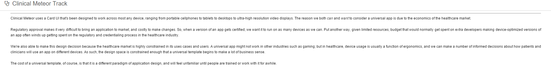
most websites have dead space somewhere. Even Facebook and Discourse (this forum software) have dead space if you expand them big enough. The design question that universal apps have to address is “Where do we put dead space?” And one of the implicit design stances is that instead of content being center-justified, it should be left-justified (leaving negative space to the right).
as for the icon, that’s full-screen mode, just like an OS window can minimize/maximize. It’s simply a windowing functionality. Might be worth moving it elsewhere. But one of the implicit design stances of a Universal Card UI App is that the control that toggles the menu can be/is synonymous with the window min/max control.
and, ah… I think I’m going to pass on cropping the images. The entire discussion is about virtual space, negative space, viewports, etc. The images are exactly how they’re suppose to be for the message I’m trying to communicate.
spacing of columns is being fine-tuned in the active-layout package. That’s simply a matter of time as we cover more-and-more edge cases and flush out bugs as we identify the core of the design concept.
contrast coloring and background color can be adjusted with the theming module.
Thank you for the other feedback. Wasn’t quite the feedback I was expecting; but since I’m dogfooding the article with the site itself, I suppose it’s legitimately on-topic.
Sure, I understand your point… I’m just saying, the reality of the site you have, the problem is all the images everywhere on the site are not readable by default. You have to expand everything to be able to read it. Simply because you have put in deadspace that COULD of been used and the images would of become readable.
Hmmm… interesting. My initial thought was something along the lines of ‘they’re not suppose to be readable; that’s not the point; we’re discussing viewports’. But the images have text in them, so that’s not really a fair response on my part.
I wonder if the checklist as an example is a distraction? Would it be a better tutorial if the checklist component were replaced with a generic placeholder of some sort?
I’m just not sure that the dead space is relevant when talking about view ports - I think it would be fine to just have the images have different proportions.
The scenario you’ve described is something I’m also very familiar with. Clinicians have great ideas to make healthcare more efficient, but little to no concept on the technology side. What I do is before I embark on investing on a universal app, I distill their idea down to solve 1-2 use cases, and build for 1 device. A short pilot project ensues, and once enough data has been collected, we run a stage-gate session to decide to proceed with the project.
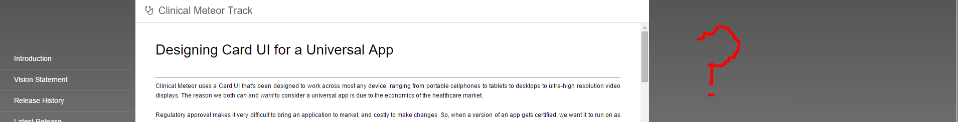
Now to the Card-Ui page. I presume the content is aimed at clinicians with little to no experience in software design. Overall, the content is very good. The benefits are clearly explained and the write up about the design considerations for different screensizes/usecases is much needed. I’m going to send my clients to this page from here on in before undergoing any new project.
Improvements wise, here are my suggestions
a table comparing the drawbacks of using a universal app versus another technology. There are tradeoffs going the universal app route. One point I have to repeatedly address is why the user-experience on a web app doesn’t compare to native apps. To the client an interface is an interface, and surely there’s a magic wand that can be waved…
removing the viewport rendering flowchart. Knowing how content is rendered on a device is interesting background knowledge, but not necessarily useful. This page is supposed to explain to the clinician what they need to think about before initiating a new software project. If anything, a short note about agile development, the need for iterations etc., would be more useful.
I’d hedge a little on the writeup about microservices. Even though FHIR has provided the blueprint for a universal EMR schema, they’re not officially supported at this time, and are subject to change.
This is a personal preference, but use fewer sentences and replace with more bullet points and block quotes to highlight key points.
Abigail, unfortunately, the link is dead together with the end of free hosting at meteor.com. Could you please put it somewhere else (i.e., github.io)?


