I work on a website (www.scienceathome.org), made with React, that is in production, and it’s using Bootstrap 4.
The main reason for using Bootstrap 4 over 3 was the flexbox, and it has worked out very well. The grid also worked as expected, very similar to Bootstrap 3. We don’t really use any other components.
I installed it by adding the following atmosphere packages:
coursierprive:tether
twbs:bootstrap@=4.0.0-alpha2
@Siyfion hence my follow up question to understand why he prefers bootstrap’s grid and not a grid-only framework, you know, since that’s the only component he chooses to use.
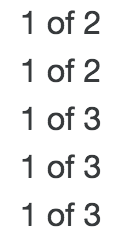
Hi ! Thanks for the feedback. How did you manage to enable flexbox in the meteor package ? It seems that it is not enabled by default. When I write this (from the docs) : <div className="container"> <div className="row"> <div className="col-xs"> 1 of 2 </div> <div className="col-xs"> 1 of 2 </div> </div> <div className="row"> <div className="col-xs"> 1 of 3 </div> <div className="col-xs"> 1 of 3 </div> <div className="col-xs"> 1 of 3 </div> </div> </div>
I’m only able to get this, which is not at all like expected :
I actually never got that part working - and I just tried for an hour without success, so it is apparently way harder than it should be.
I simply used flexbox directly from my stylesheets, and I expected it to play nicely with bootstrap 4 as it also was made using flexbox. So for your example would I not use col-xs, but simple give them a class and style it using flex-grow.
Humph, that’s odd. Did you add the variable before importing Bootstrap? I’m happy to take a look at your code if you can’t resolve it. I’ve got flex grids working on my in-progress site.