Deploying on iPhone X

My apologies if I’ve missed information about this.

I’m keen on deploying my Meteor apps to iPhone X, using the full screen. The only communication on this I’ve seen is the following brief mention in the Meteor docs:

On iPhone X it is likely required that you use launch story board images if you want the launch image to cover the entire screen. There are also other app layout issues that need to be adresssed such as “safe areas” and “rounded corners”, see Apple’s iOS app updates for iPhone X.

Is there more detailed information on how to deploy Meteor apps for iPhone X?

Yes, will need to do a manual install of cordova-plugin-statusbar@2.3.0 to solve status bar height issue with Cordova. Also, you will need to add <meta name="viewport" content="viewport-fit=cover> to your <head> tag to make sure splash screen and app cover all the screen. I’ve created this Pull Request to add these to Meteor.

In addition, you will likely need to add some application specific iPhone X bottom padding and left, right, and bottom padding when in landscape mode to deal with overflowing into “bump” and virtual home button.
See https://developer.apple.com/ios/update-apps-for-iphone-x/

Apple provides some CSS constants (env values) that provide the correct padding and are called: safe-area-inset-bottom, safe-area-inset-left, safe-area-inset-right, and safe-area-inset-top.

If you have a Cordova app you can use the device model plugin to detect running on iPhone X and apply this padding as needed.

2 Likes

Thanks. That seems workable, if elaborate :slight_smile:

Here’s what I ended up doing.

I extended the viewport meta tag in main.js:

<meta name="viewport" content="viewport-fit=cover, user-scalable=0, initial-scale=1.0">

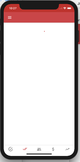
This did not result in splash screens on the iPhone X simulator to take up the full screen. In the simulator, the app worked as ‘normal’, with thick black bars above and below the interface.
But, the corners of the interface were rounded.

I also tried the below, but this just made my app look like a full-width website being displayed on a tiny screen:

<meta name="viewport" content="viewport-fit=cover">

I added splash screens for iPhone X in mobile-config.js:

App.launchScreens({
	...
	'iphoneX_portrait': 'resources/splash/screen-iphonex-portrait.png',
	'iphoneX_landscape': 'resources/splash/screen-iphonex-landscape.png',
	...

});

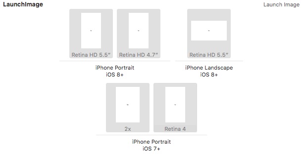
This did not result in the splash screens for the iPhone X showing up in the list of launch images. Or, at least, I think so. See image below.

xx

This also didn’t change the way the app worked in the iPhone X simulator.

I added the cordova plugin to allow me to check for whether the user is on an iPhone X:

meteor add cordova:cordova-plugin-device@1.1.8-dev

This did what it was set out to do, but was not helpful. In the iPhone X simulator, device.model returns x86_64, which identifies MacOS, not whatever string the iPhone X is supposed to return.

Apple’s page on updating apps for iPhone X (as mentioned by @skirunman) specifies:

Enable full screen native resolution. Your app will run in Full Screen Display Mode on iPhone X if your project’s base SDK is set to iOS 11 and you have a Launch Storyboard or iPhone X launch image.

Under ‘Build Settings’ in Xcode, the ‘Base SDK’ setting for me is ‘Latest iOS (iOS 11.2)’.
With Meteor, a ‘LaunchStoryboard’ is not automatically created, but I added the same .png for all versions of ‘Any Width Any Height’ under ‘LaunchStoryboard’.

This did not make any difference.

So, I still would like to know how to get my Meteor app to deploy to iPhone X, using up the full screen. :confused:

Unfortunately building an iOS app with Cordova is always a moving target because of the changes from Apple and then the time lag for fixes to deal with those changes being implemented in cordova-ios and then that version of cordova-ios being supported in Meteor.

Assuming you are running Meteor 1.6 and Xcode 9.x, I think you are going to need to use iOS launch story board images, see the latest info in the Meteor Guide.

Remove all the iOS App.launchScreens directives from your mobile-config.js and use App.appendToConfig to add the paths to your universal images.

App.appendToConfig(`
  <splash src="../../../app/path/to/Default@2x~universal~anyany.png" />
  <splash src="../../../app/path/to/Default@3x~universal~anyany.png" />
`);

This is what worked for us to have launch screen cover entire screen on iPhone X, plus it has the added benefit of not having to maintain all those separate launch screen sizes anymore.

Note: you will still see a white bar at the bottom of the splash screen on initial boot that is fixed in Meteor 1.6.1 with this pull request.

Some screenshots of our app on iPhone X simulator to show you the white bar at bottom, which does go away in a 1-2 seconds.

Thanks for the follow up. My trajectory was a bit rocky and I’m not sure what finally did (most of) the trick, but below is my current situation. My current issue is how to identify an iPhone X and how to identify the iPhone X simulator.

I removed .meteor/local/cordova-build/ between builds after changing mobile-config.js.

I added this to my mobile-config.js:

App.appendToConfig(`
  <splash src="../../../resources/splash/Default@2x~universal~anyany.png" />
  <splash src="../../../resources/splash/Default@3x~universal~anyany.png" />
`);

I removed all App.launchScreens directives related to iOS, in meteor-config.js. This made me feel good.

I added cordova-plugin-splashscreen@4.1.0, as per your suggestion in this thread.

Eventually, the app built and opened in Xcode, where the app also built and presented a fullscreen launch screen for iPhone X. Interestingly, the launch screen at some point jumped a few pixels.

Then, the app opened full screen. But, without the margin required at the top of the screen.

To prevent this from happening, I need to know whether my user is on an iPhone X. You mention that using device model plugin, I can detect the device. But, in my Xcode simulator, the model is x86_64, which identifies my Mac, with the platform being iOS, and the device version being 11.2. So, at least in the simulator, this does not work.
What is the model string that the iPhone X would return?

Using a library like WURLF doesn’t help either, as this tells me that the simulator is running on the form_factor Desktop.

I suppose I could hack this by monitoring the window size, with the iPhone X, at least in the simulator, returning a width of 375 and a height of 734 (while the real dimensions apparently are 1125x2436), but that is rather precarious.

So, how to detect whether my app is running on an iPhone X, or an iPhone X simulator?

I’m now monitoring the ratio of the width and height. If the screen is tall, I’m assuming it’s an iPhone X and I add spacing above the top menu bar.

Is there a way to do this before the pull request lands in an official Meteor builld? I tried many approaches but all failed. Seems as if Meteor’s viewport settings always override mine.

We do this in myApp/client/main.html which will get loaded first using Meteor’s default application load order.

Our main.html looks something like:

<head>
  <meta charset="utf-8">
  <title>myApp</title>
  <meta name="description"
    content="myApp is really cool.">
  <meta name="viewport"
    content="viewport-fit=cover, width=device-width, height=device-height, user-scalable=no, initial-scale=1, maximum-scale=1, minimum-scale=1">
  <meta name="apple-itunes-app"
    content="app-id=123456789">
  <link rel="manifest" href="/myApp-manifest.json">
</head>

<body>
  <div id="myApp"></div>
</body>
1 Like

We are using storyboard instead splash screens now the top and bottom issue seems to resolve as we checked it in xcode but white screen is showing after the storyboard launch for some time and then app is showing. Rounded corner/top notch is still persist even after adding storyboard. And also added viewport-fit=cover in main.html.